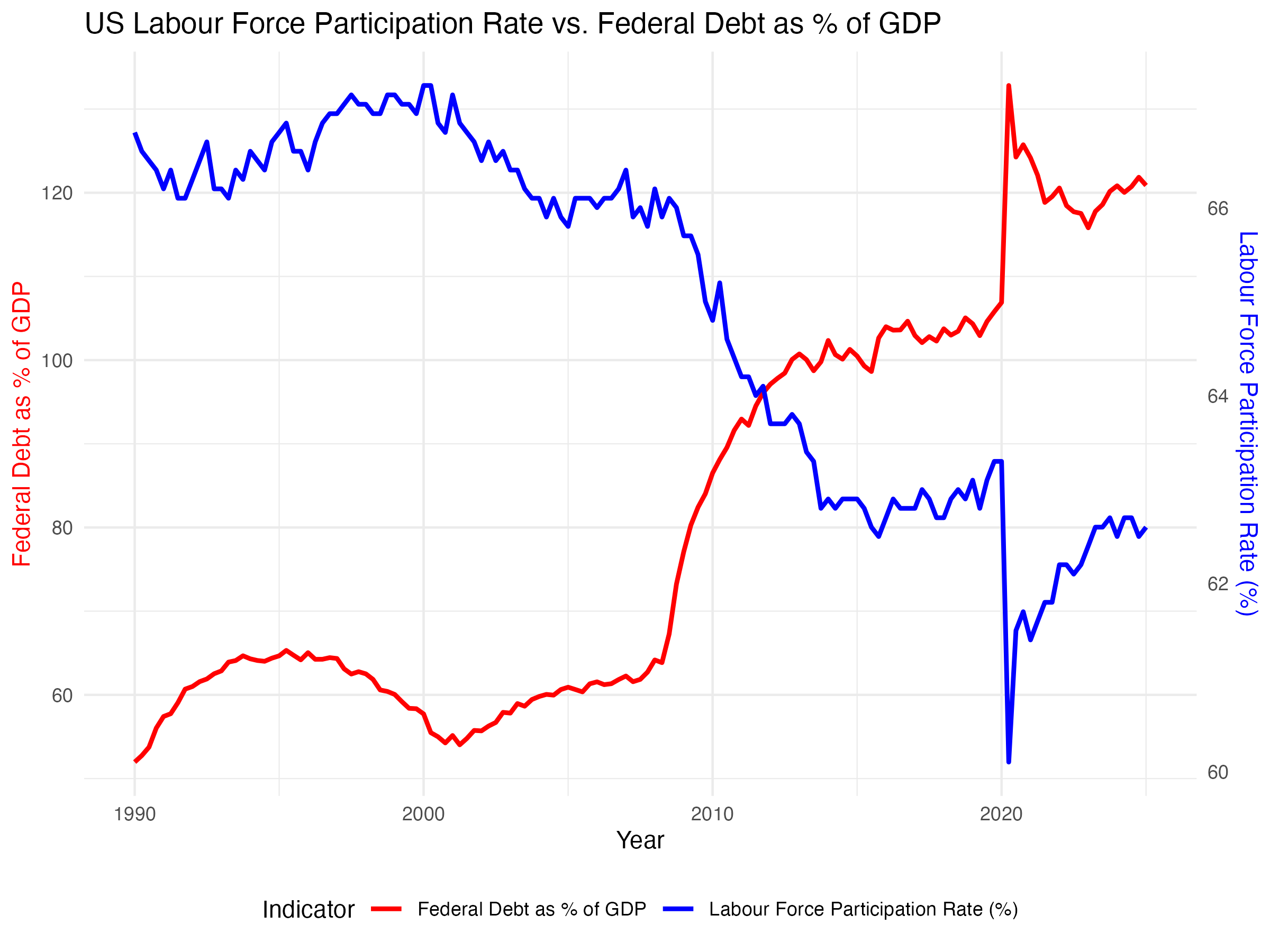
As populations age, labour force participation declines. This chart shows the long-term decline in the labour force participation rate (LFPR). The data is sourced from national labour statistics and census data, showing how demographic shifts impact government debt. As the proportion of retirees rises, fewer workers are left to drive economic productivity. This trend creates structural challenges: fewer workers means a smaller tax base, while entitlement programs like pensions and healthcare require increasing government expenditure. This dynamic helps explain the secular rise in government debt in ageing societies. It’s a foundational block of the macro framework — ageing leads to more spending and less income for the state.
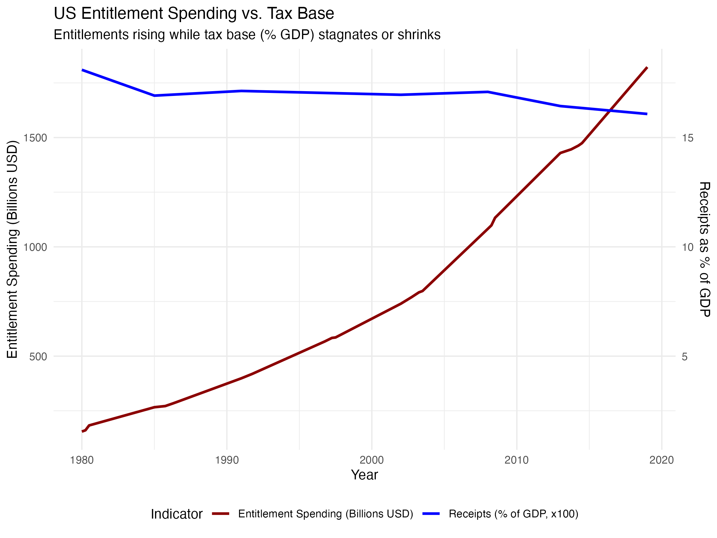
This chart highlights the growth in US entitlement spending — Social Security, Medicare, Medicaid, and other mandatory programs, while the government revenue from taxes does not rise to keep up with their increasing cost. This data is from the Congressional Budget Office and federal spending reports. As the population ages, shown in the previous chart, entitlement programs consume an ever-larger share of federal budgets. These aren't discretionary; they grow automatically with demographic trends. These data explain why governements are forced to borrow more to meet their obligations, pushing debt-to-GDP ratios higher. This reinforces the macro view that ageing societies face unavoidable fiscal pressures, which in turn require either rising taxes (unlikely politically) or more borrowing (the path taken).
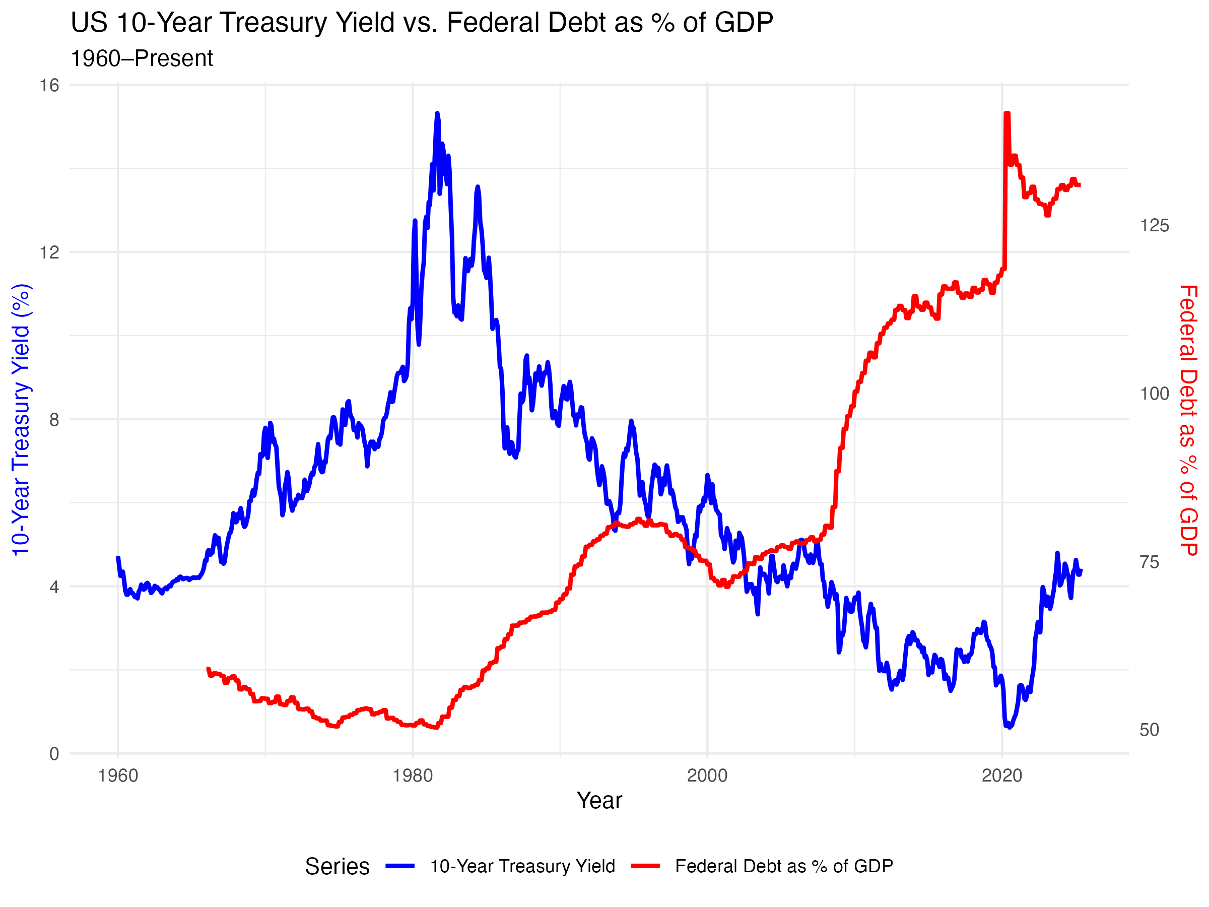
To manage rising debt loads from entitlement spending, governments and central banks have pursued ever-lower interest rates. This chart shows how interest rates and public debt levels have diverged — debt increasing while interest rates fall. Central banks have lowered rates to make growing governemnt debt piles affordable. This supports the thesis that monetary policy is now subordinated to fiscal needs — what some call “fiscal dominance.” Lower rates are a necessity in a debt-fueled world, not a policy choice. What does this divergence between interest rates and government debt mean for the world? These consequences are a core part of this macro framework.
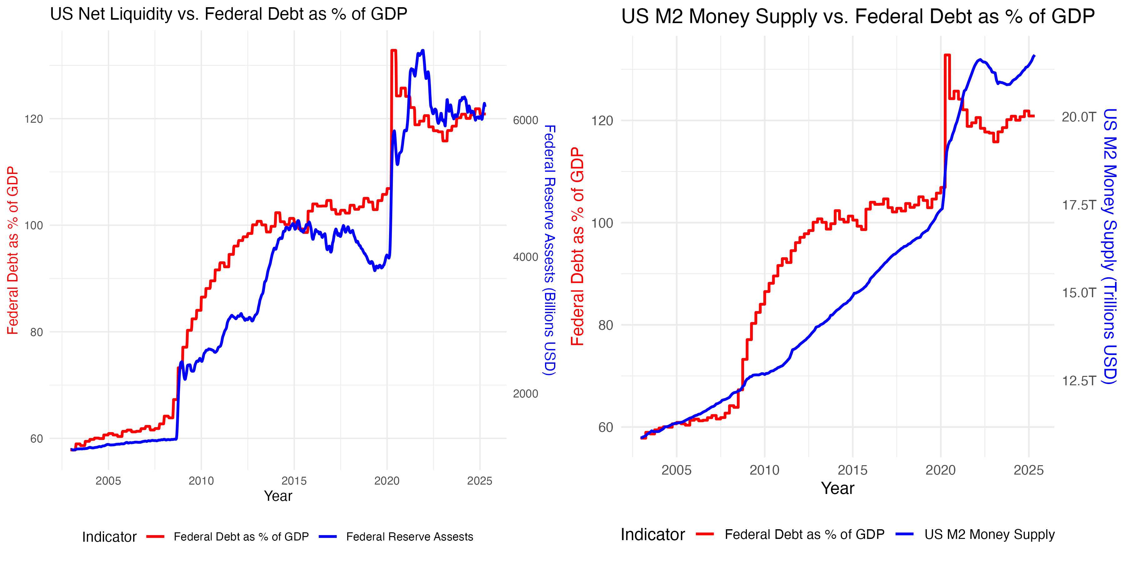
The charts here show how more recently central banks and commercial banks have absorbed excess government debt. The left chart shows the US Federal Reserve bank balance sheet and governemnt debt as a % of GDP. The right shows the relationship between M2 money supply and governemnt debt as a % of GDP. M2 money supply includes cash, checking deposits, and easily convertible near-money like savings accounts — it's a broad measure of money circulating in the economy. Both these charts show that the Federal Reserve balance sheet and economic money supply (M2) have expanded with government debt. When commercial banks buy government bonds or extend credit backed by government debt, their balance sheets expand, increasing deposit money and thereby inflating the M2 supply. When the debt can't be sold into the market without driving rates up, central banks step in to buy more. These trends support the view that growing fiscal deficits are being monetized — either directly or indirectly — by monetary authorities. This “money creation” to support debt markets explains the next phase: asset inflation.
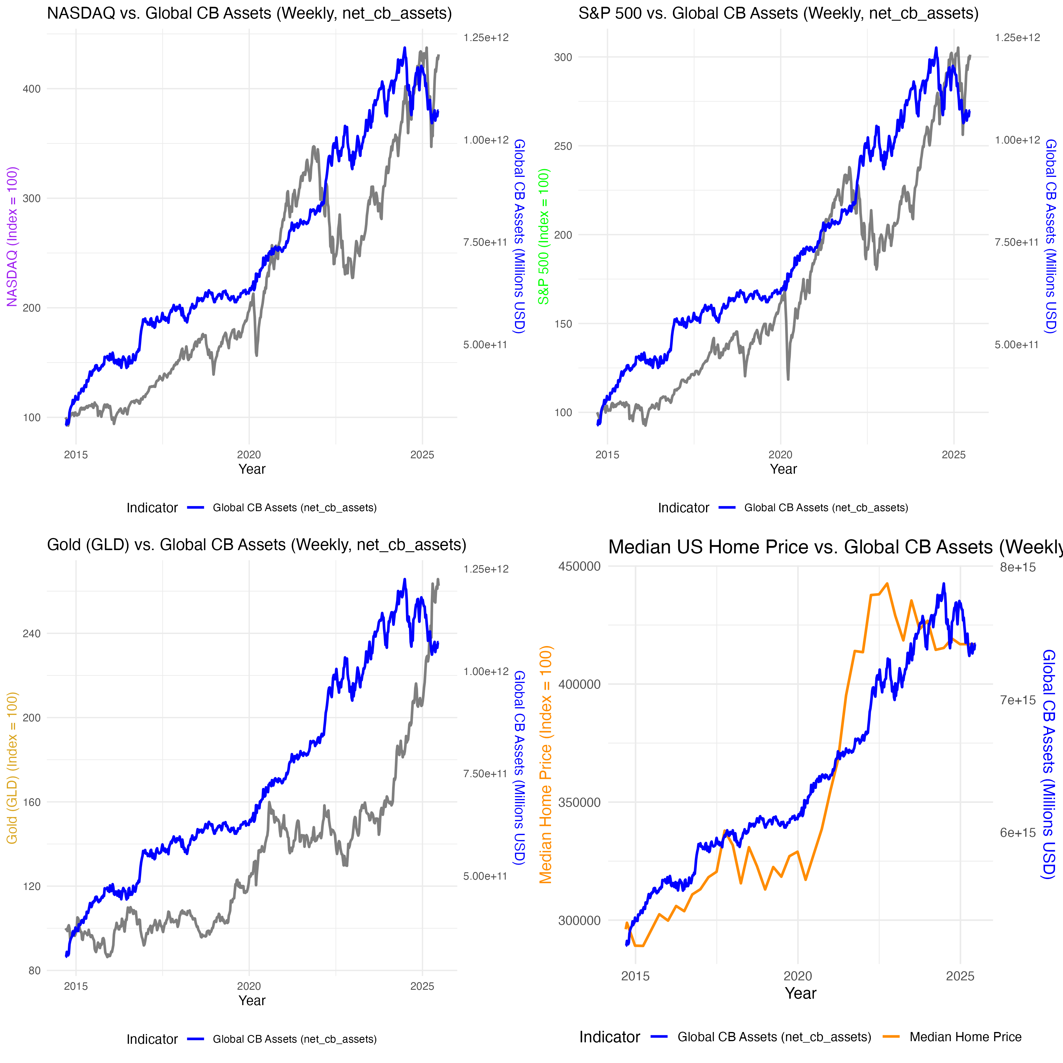
These four charts (NASDAQ, S&P 500, gold, and US home prices) show how asset prices have inflated in response to loose monetary policy and liquidity injections. Cheap money flows into assets — financial and real — pushing prices upward. This creates wealth inequality: those with assets (stocks, gold, real estate) get richer, while those without are left behind. This is the transmission mechanism from “money printing” to asset bubbles. It supports the macro narrative that monetary debasement disproportionately benefits the wealthy and exacerbates social inequality.
The macro backdrop table shows the dominant forces shaping asset returns over the period: net global central bank assets expanded at close to a 19% annualized rate, while consumer price inflation averaged around 2–3% per year. This establishes a very high hurdle for preserving real purchasing power. The asset return tables show that while equities such as the NASDAQ and S&P 500 delivered strong nominal gains, even these struggled to keep pace with the scale of monetary expansion once returns are measured relative to central bank balance sheet growth. When both monetary expansion and inflation are accounted for, all major asset classes — including equities, gold, real estate, bonds, and cash — exhibit negative adjusted returns, with cash and government bonds performing worst due to near-zero nominal yields. From an investment perspective, this highlights a regime in which traditional “safe” assets fail to protect wealth in real terms, and where even risk assets primarily serve as partial hedges against monetary dilution rather than true sources of real growth.
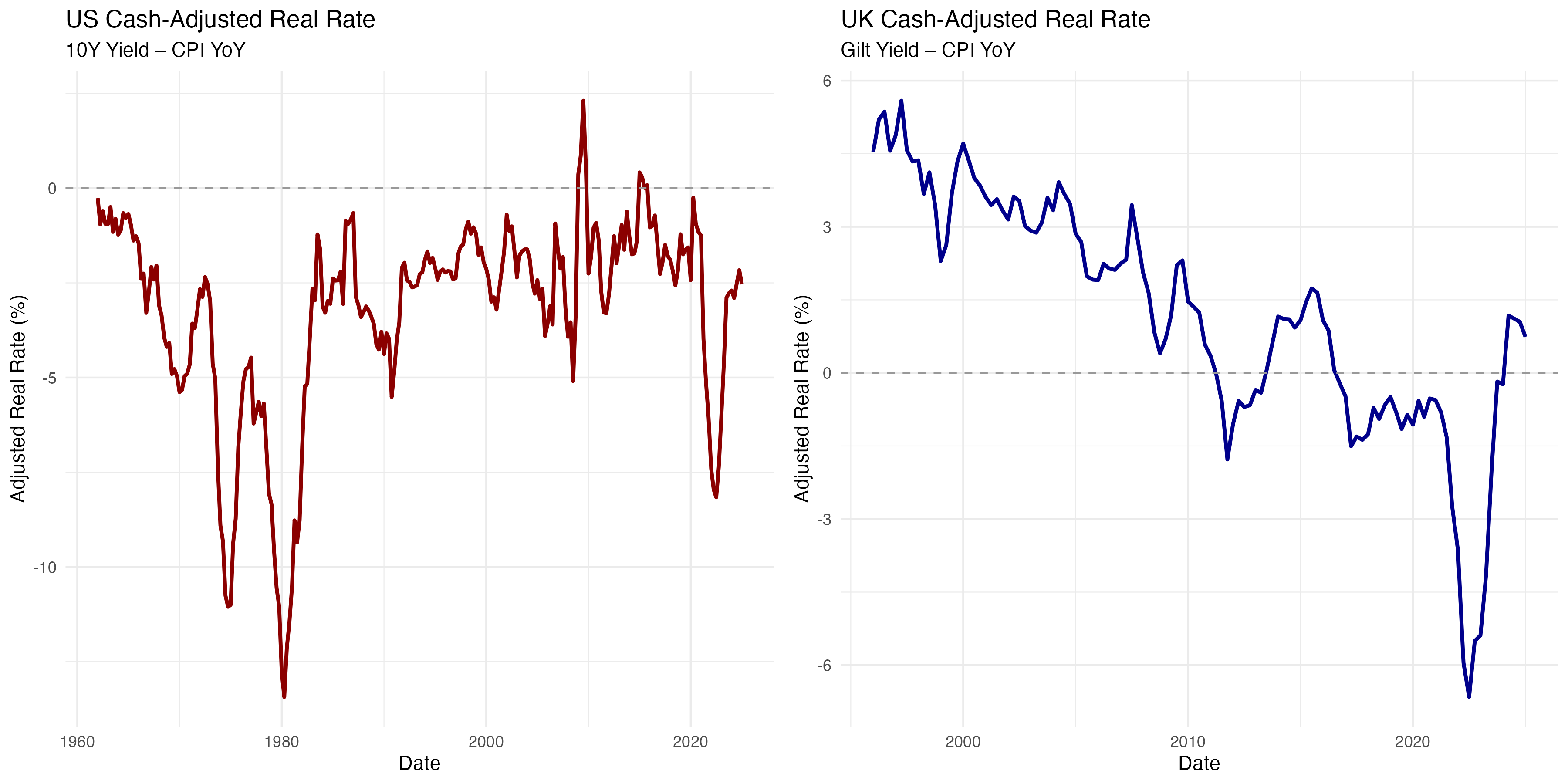
This set of charts shows real interest rates in the US and UK — nominal rates minus inflation. In both cases, we see prolonged periods of negative real returns on cash or bonds. This has major implications for savers, particularly retirees who rely on fixed income. Their purchasing power erodes over time, leading to wealth destruction for non-risk takers. From a macro lens, this is a form of hidden taxation — financial repression — that forces savers into riskier assets or erodes their wealth. Financial repression refers to the deliberate policy of keeping interest rates below inflation, often used by heavily indebted governments to reduce the real value of their debt over time — effectively shifting the burden from the state onto savers through negative real yields.
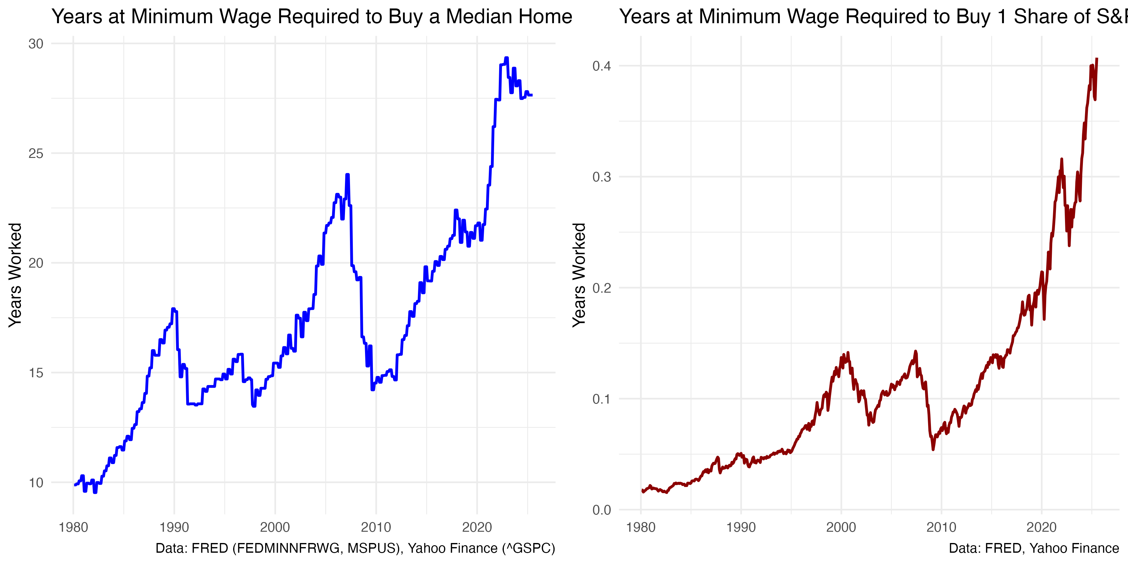
These final charts illustrate the divergence between asset prices and labour income. Wages have stagnated while asset values have soared. For those without inherited wealth or asset ownership, particularly the young, the economic system appears unfair. This supports the view that monetary and fiscal policies have driven intergenerational inequality. Labour — the main source of income for the majority — is insufficient to accumulate wealth in an inflated asset world. This is the social consequence of monetary expansion: discontent, populism, and structural pressure for political change.
Coming soon... What to do about it
These charts were all created by bitstrategy but this macro framework was inspired by the work of Raoul Pal (The Everything Code), Lyn Alden (Nothing stops this train) and Michael Howell (Capital Wars)
To chat bananas: bananas@bitstrategy.co.uk